You guys! Eeek. I’m so excited to finally invite you into my apartment! It's been YEARS since I've shared a look at the space! You may remember my bedroom featured on Lonny last year and my living room office in Rue Magazine back in 2014. WOW. I can't believe how long it's been. In that time, my space has truly evolved into something that is 100% me, and that feels really good. As a freelancer, I spend SO much of my time at home, and it is really important for me to have a space that makes me feel inspired, cozy, energized, safe, happy — all the feels! Come on in...
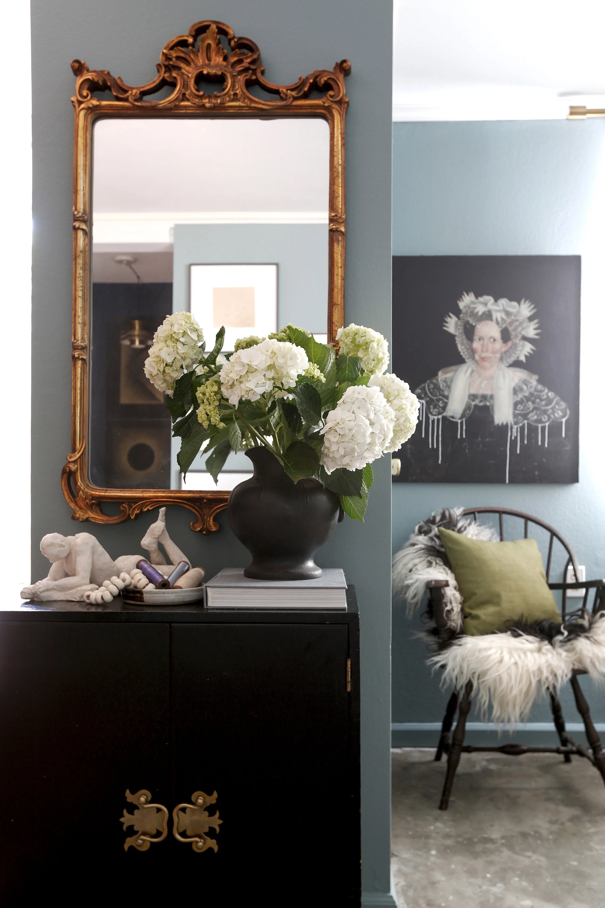
When you walk in, you just, walk in! There's no formal entry or anything of the sort, but I really wanted it to feel like there was. So I carved out a tiny piece of the living room that acts as such. A mirror and cabinet do the trick — all you need is a place to drop keys and to check yourself before you head out the door. I struggled with this small, awkward wall for a while until I found this cabinet (for free!) at an estate sale, and it was the perfect size! The mirror really helps open up the space and makes it feel bigger. The art is antique and painted over by myself and I particularly love this metal chair, from an old library in Philly, that I scored on Craigslist for $10.
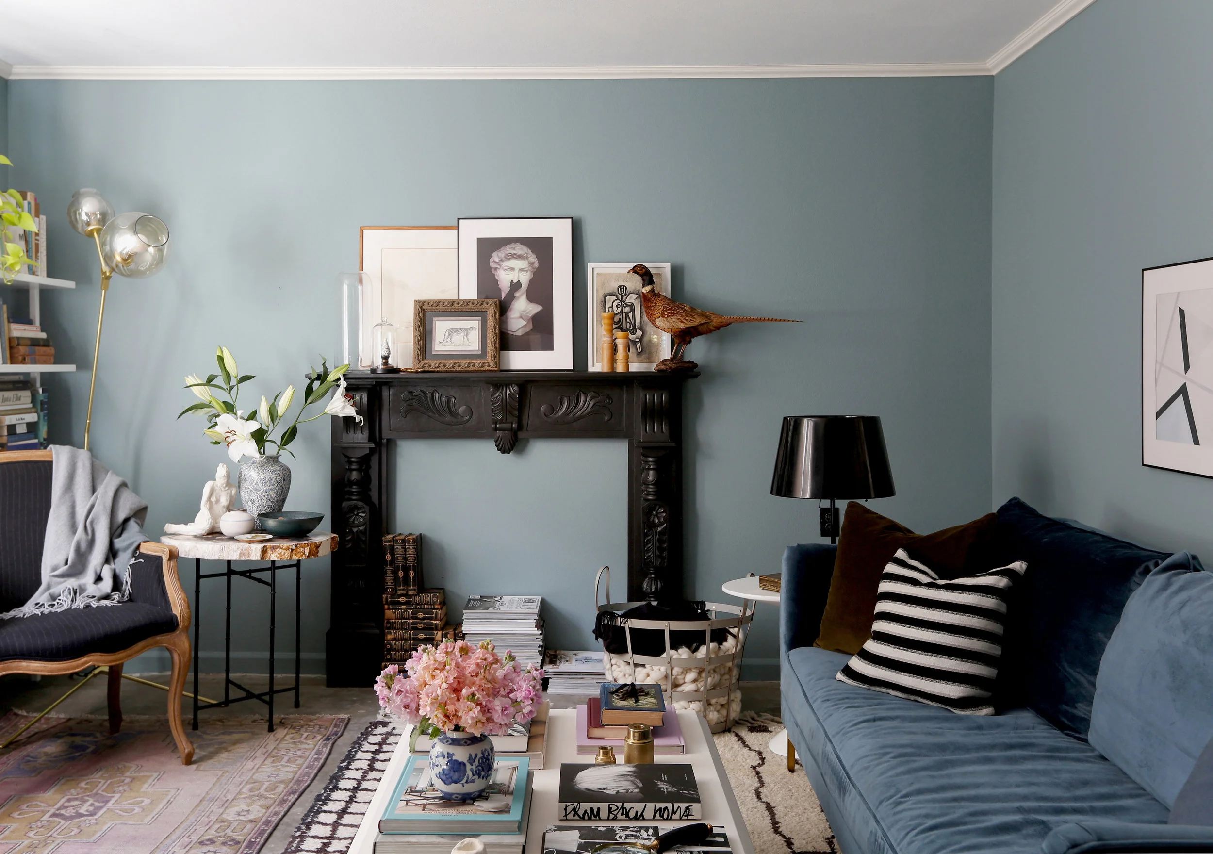
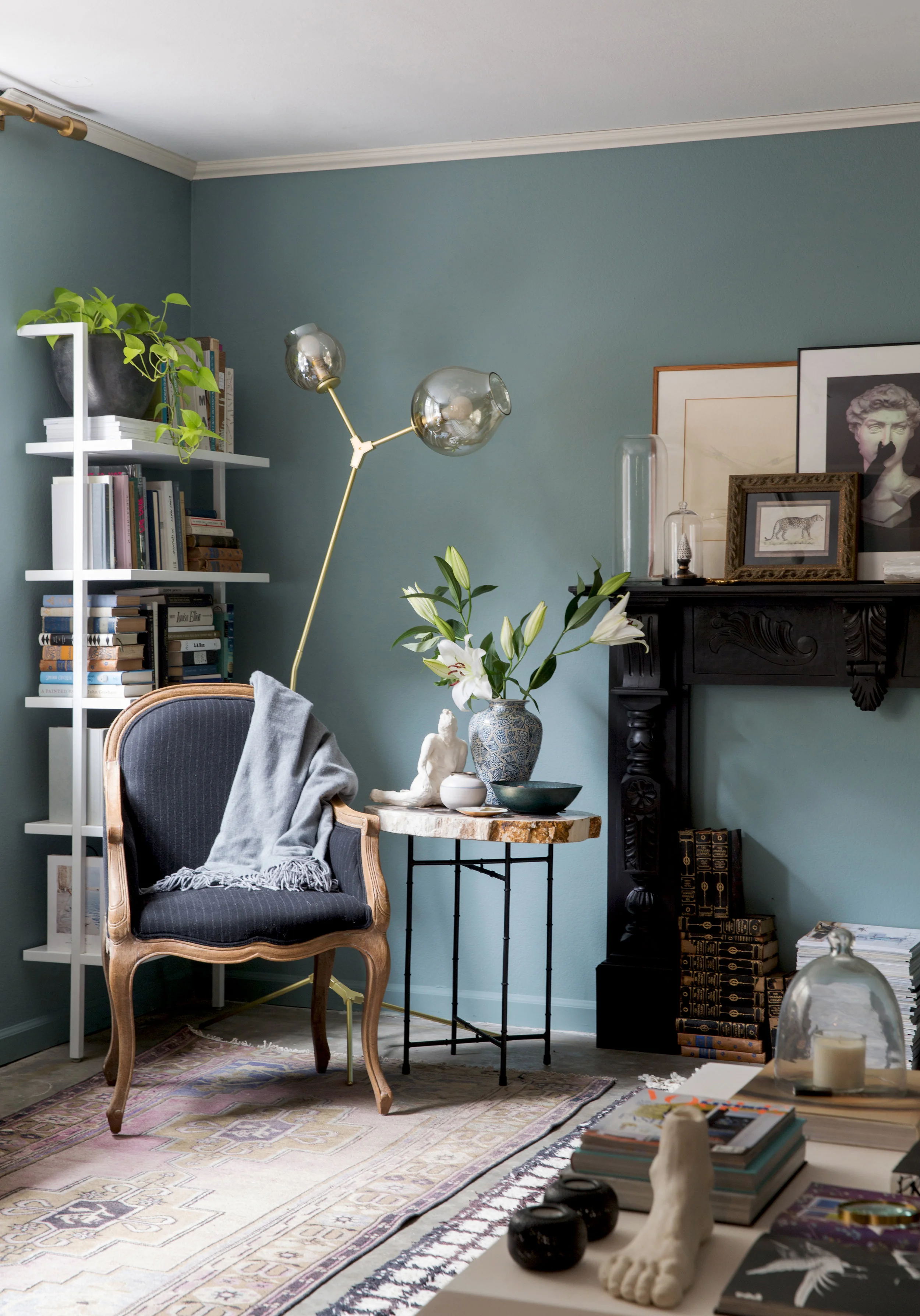
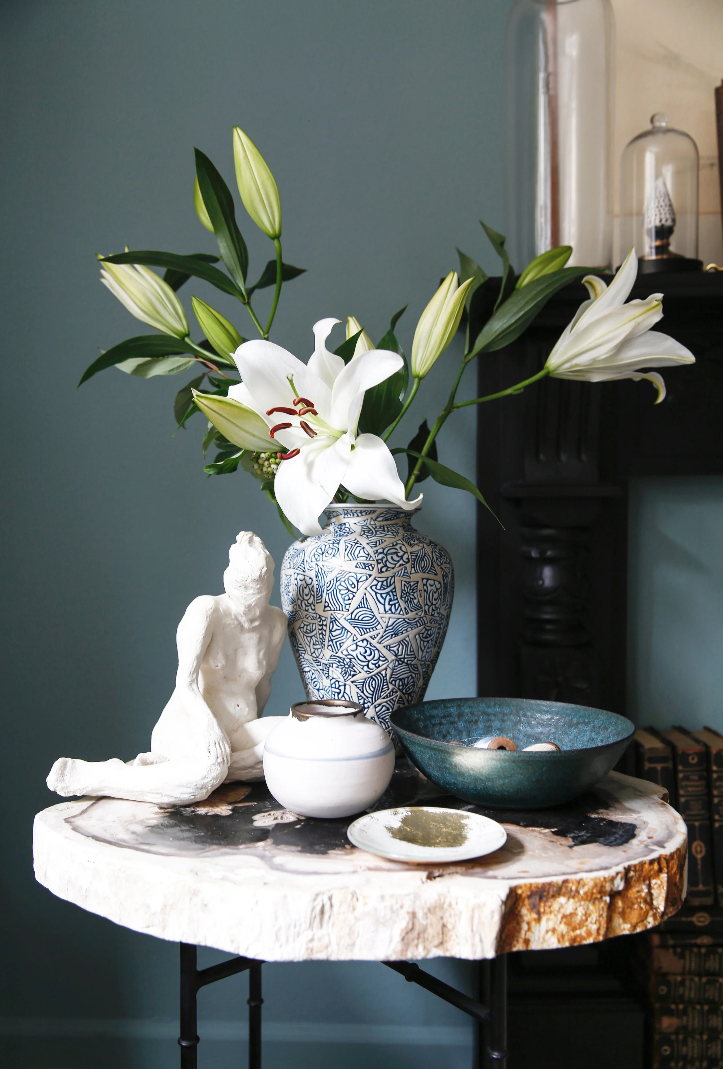
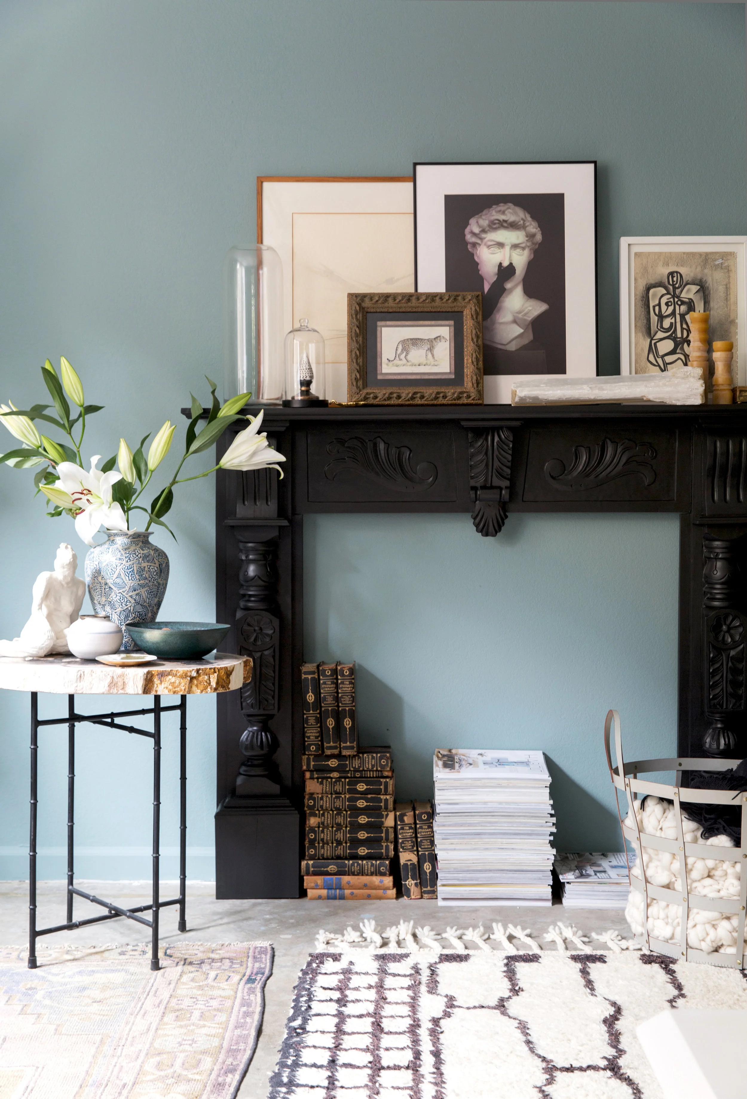
There's so much to talk about in the living room. Oh, where to start. Let's work backwards with the latest additions? I have always craved some architectural detail that didn't break the bank. I dreamed of a mantel, because duh, the styling possibilities are endless. I finally found one this year on Craigslist for a steeeeal. I painted it black and it's my favorite element in the room. I also added some crown molding which really helps elevate the space from rental to home, in my opinion.
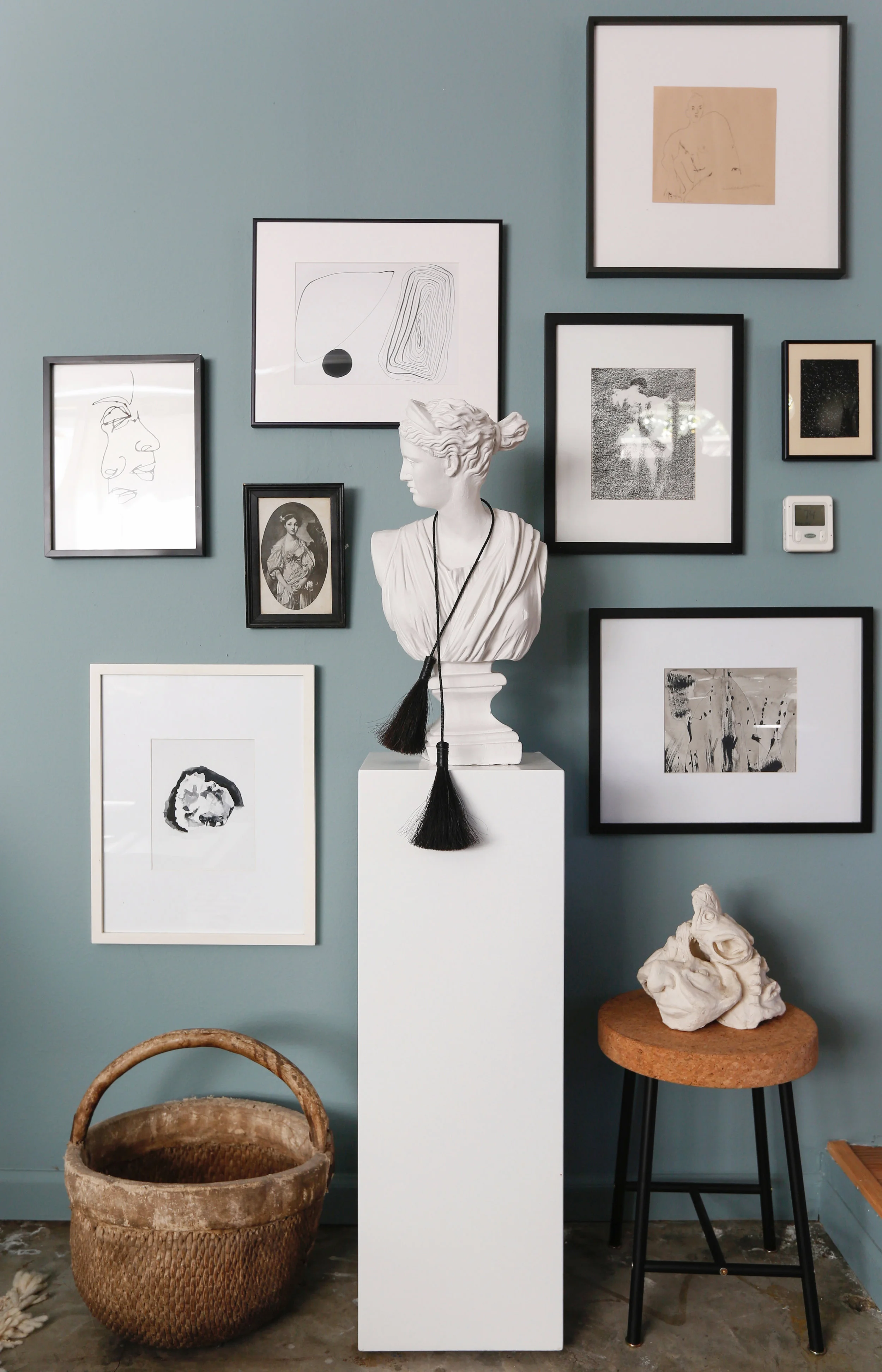
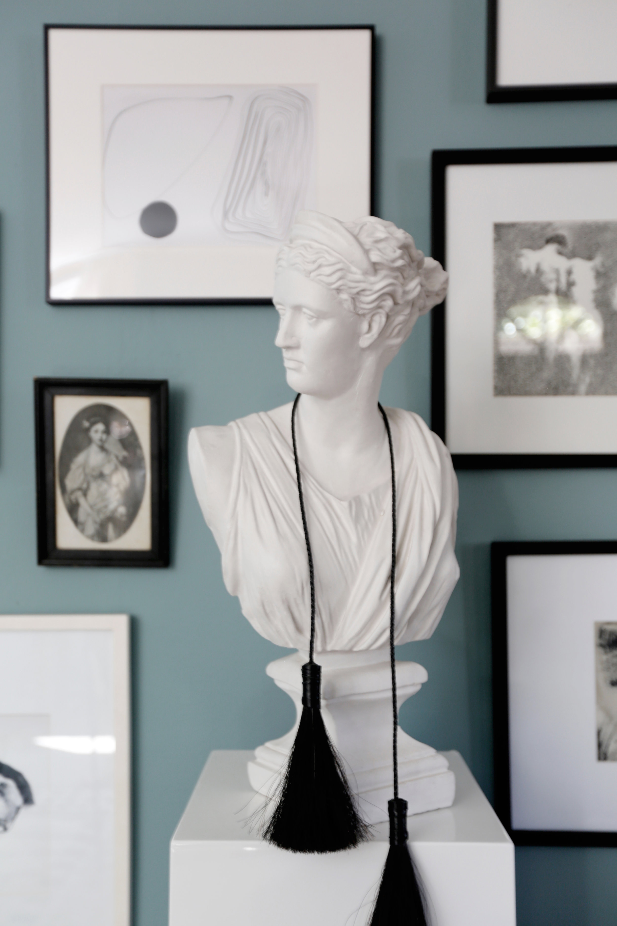
Amongst a few other first world problems, one of them is that I have a ton of art, and not enough wall space! Over the years I've done a million and one takes on the gallery wall. I'm finding this current break up of wall space the best so far! I grouped art leaning on the mantel and grouped others around a bust to create an all black and white gallery. Keeping them grouped really helps things feel contained and less like a crazy museum. Most of my art was found in antique stores or at estate sales and flea markets, with the exception of some modern additions from Artfully Walls. I love the mix of old and new, and am especially fond of the bust guy on the mantle (get him here) who is the perfect piece — playful, neutral, old-meets-new, statement making.
The art pops off of the blue walls, painted in Farrow & Ball's Oval Room Blue. It was a moody match to the Caitlin Interior Define sofa in Velvet Sapphire, and I love the monochrome vibe the two pieces bring to the room.
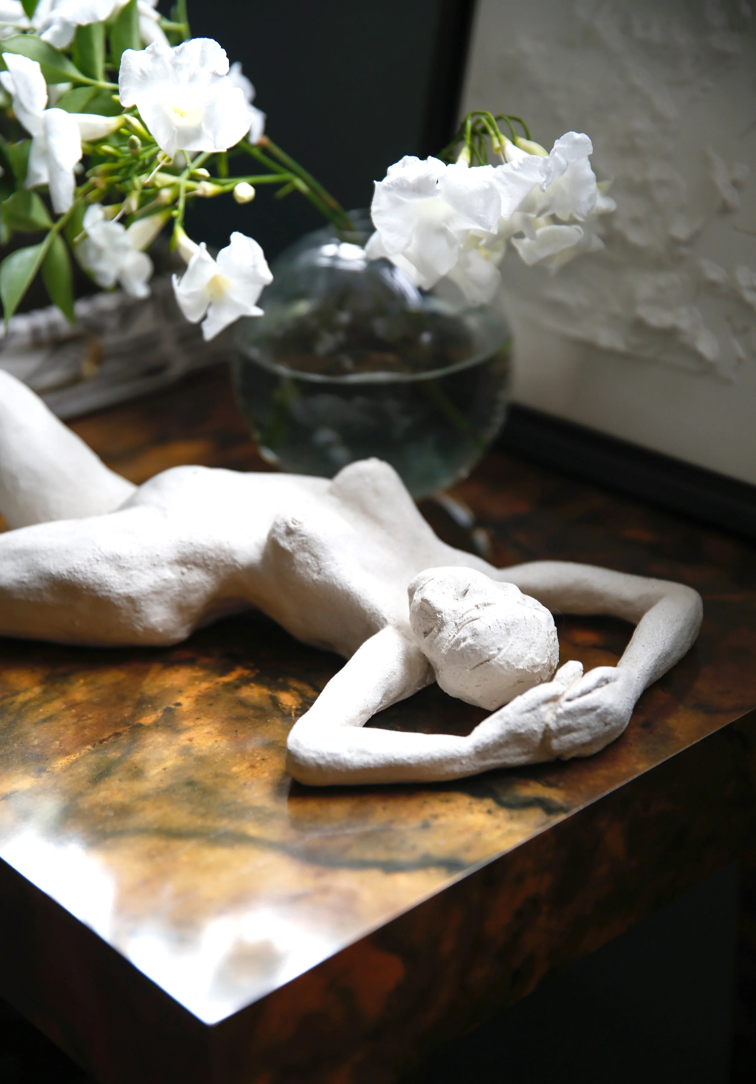
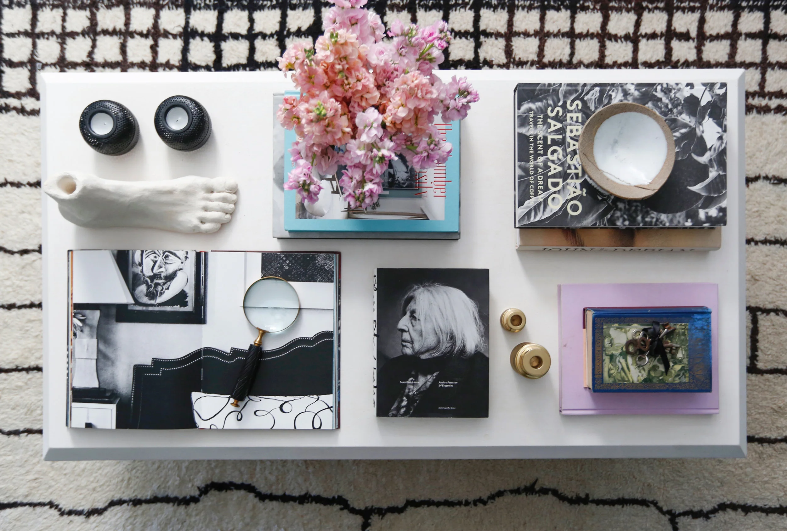
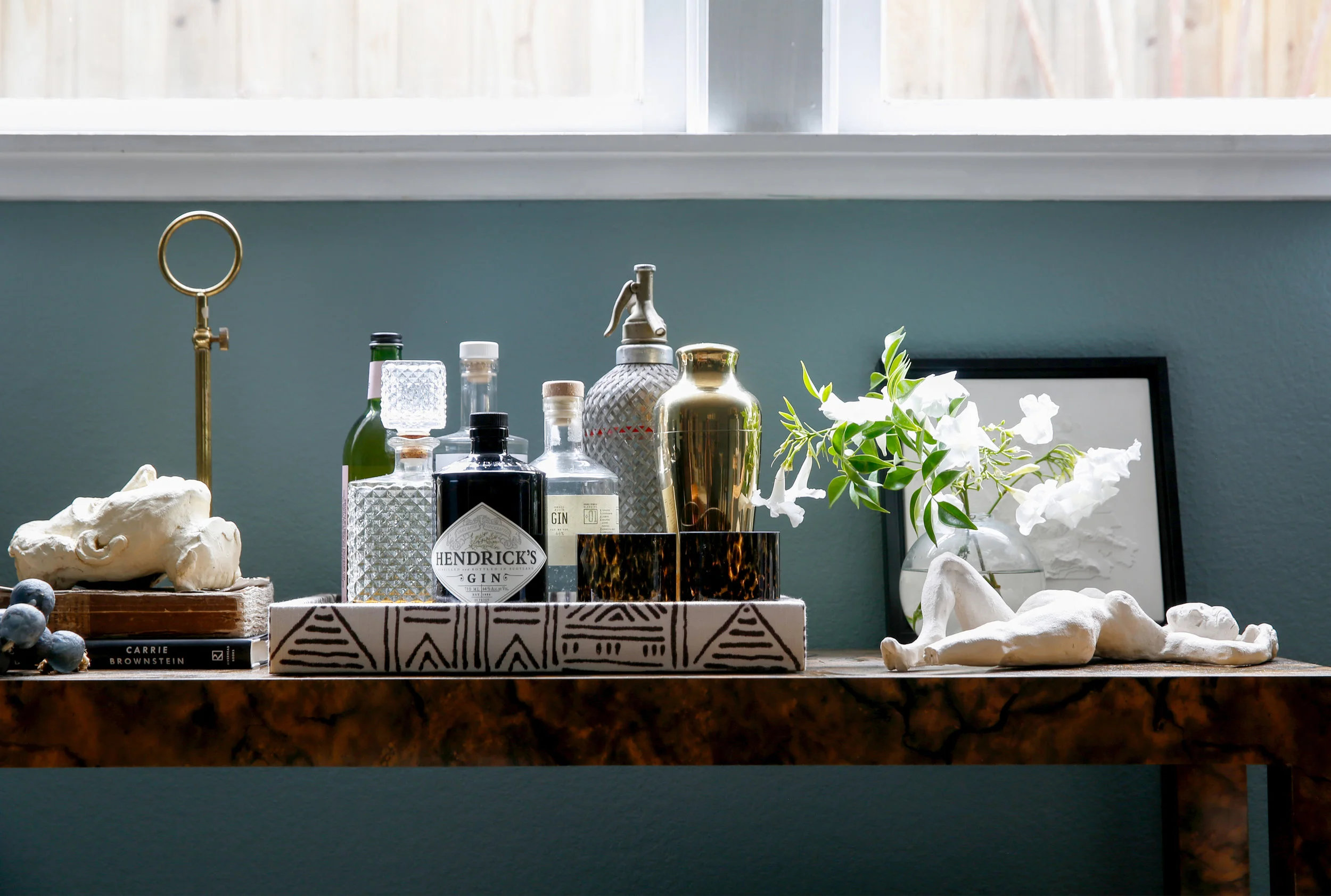
My curiosities or decorative accessories (or whatever you fancy calling them!) have been collected over time, so the best I can do is share my favorite sources for a good hunt!! I’m always in Salvation Army — the hunt for the diamond amongst the crappy is my idea of a good 3o minutes spent. I’m always grabbing new/old French antiques at one of my favorite Bay Area stores, Elsie Green. And I get a thrill from stopping in random town’s antique stores, scrolling through the free stuff on Craigslist and spontaneously pulling over if I see a good garage or estate sale! Another amazing resource and site that I could get lost in for hours, literally, is EBTH. Beware! It's so good.
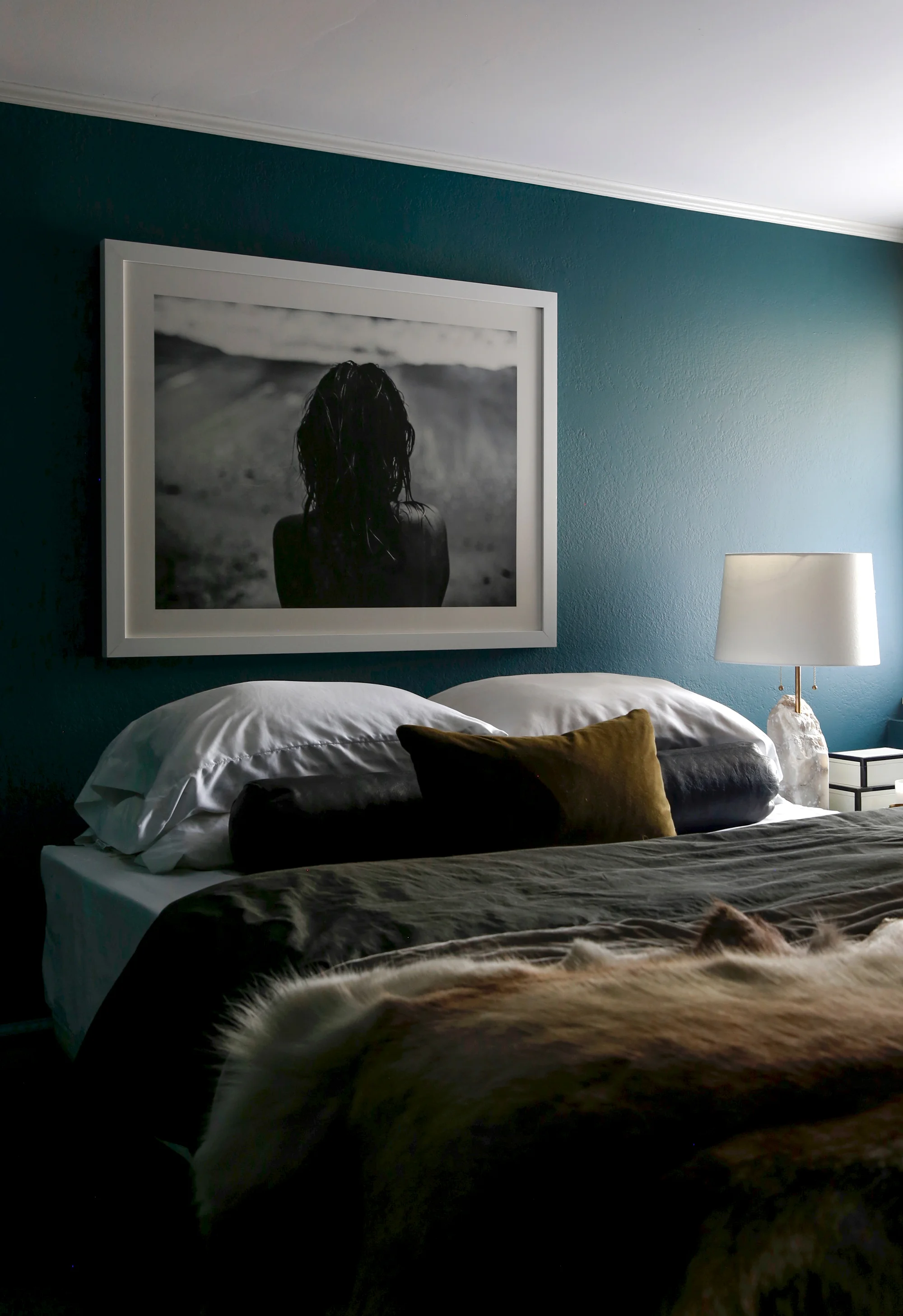
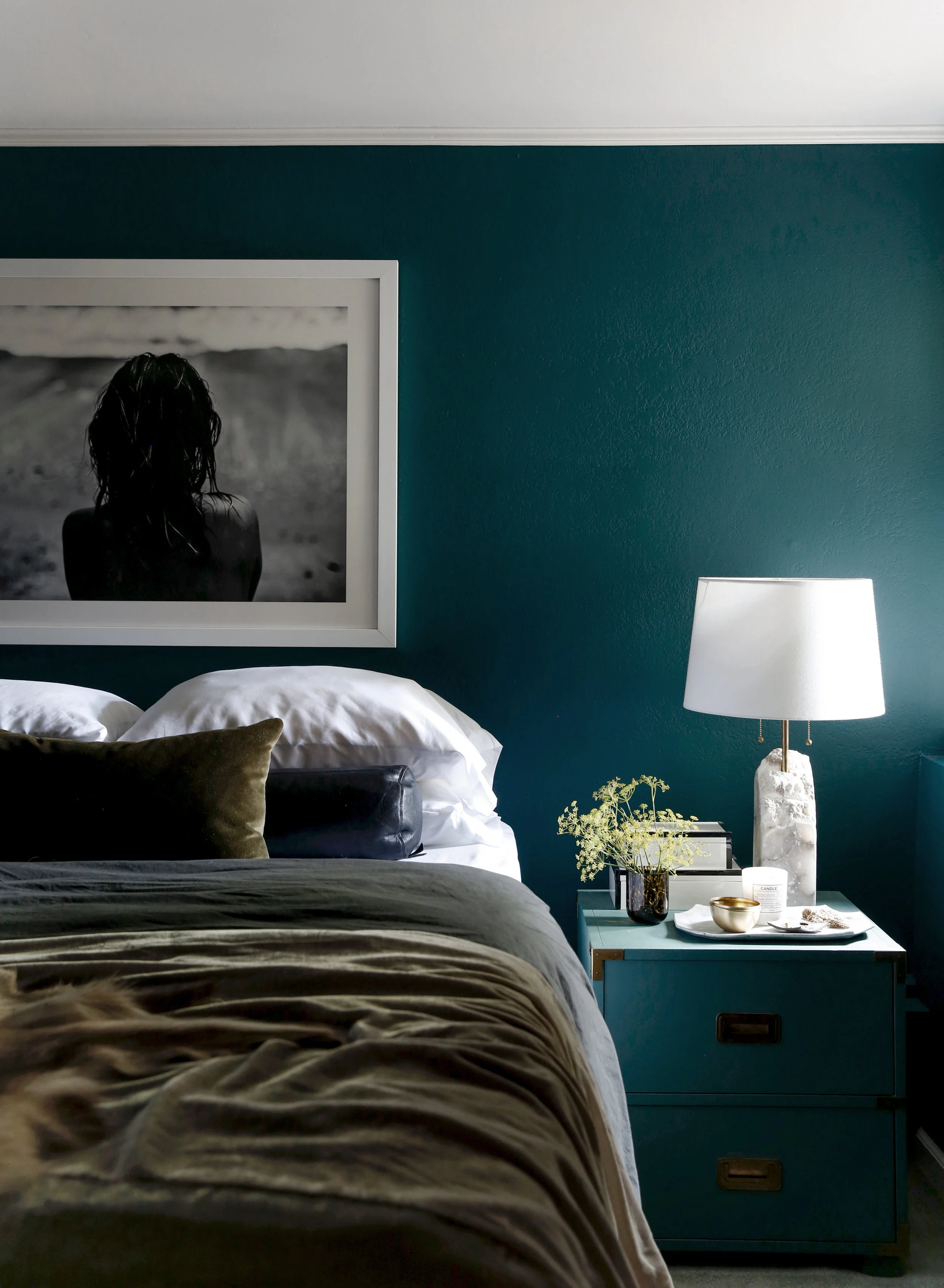
My bedroom is my little jewel box. It’s crazy to think that I used to NEVER go in it. It was purely a room that functioned as a place to sleep. After painting it a moody teal (Benjamin Moore's Dark Teal to be exact) and warming it up with some favorite pieces (like my insane antique French mirror from Elsie Green!), it’s now a place I hang in all of the time. When I need to unwind and be by myself, the dark walls really help my mind rest, and for that reason, I purposely left decor simple. Since it’s a place of relaxation, I didn’t want to be overstimulated with a super layered space.
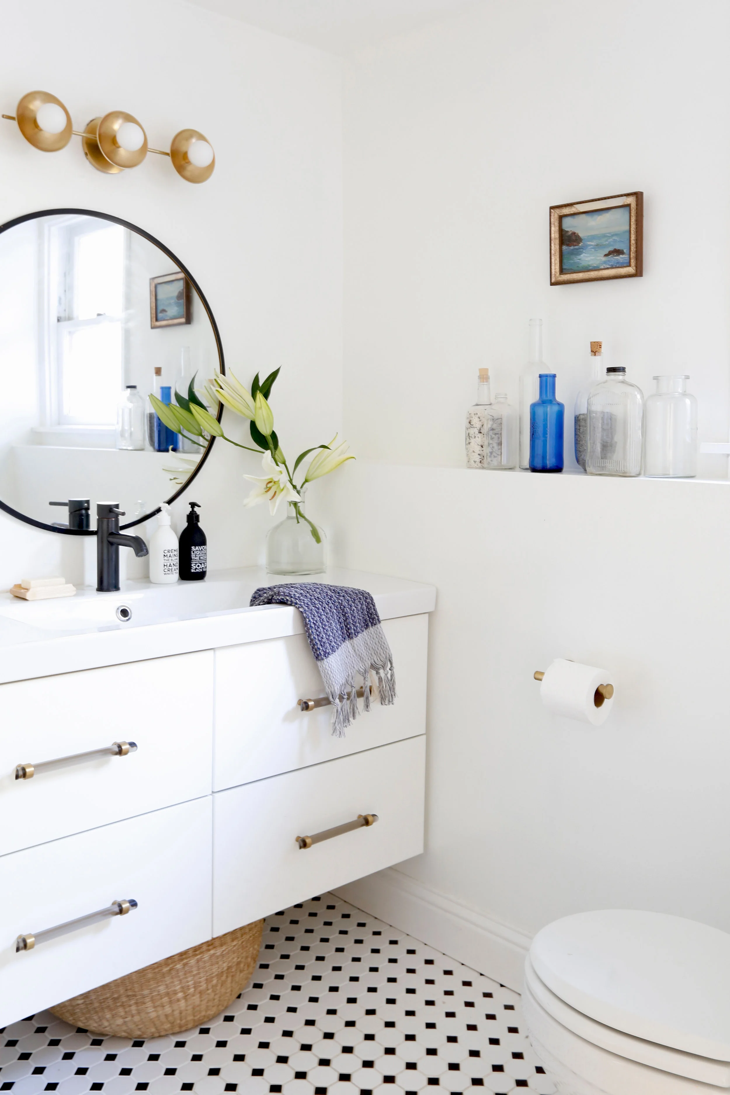
It's so hard to pick a favorite room because everyone really serves a different purpose, but boy the bathroom is a favorite. You should have seen the before! Actually, I'm going to share it with you soon so stay tuned. The dated beige tile and walls on top of the rotting out vanity were not a good look. So I spent about $1300 to give it a facelift. It took me a while to pull the trigger to "invest" but I'm so glad I did. I went with the cheapest vanity I could find from Ikea. I customized it with some not-so-cheap lucite and brass pulls found on Etsy. The mirror, which I painted black, is totally from Target, and the light was a SUPER great score on Wayfair! The tiles aren’t fancy — just from Home Depot — but gosh, they look good. We added a base board for extra detail, and of course, slapped a fresh coat of white paint on the walls. Let this be proof that you don’t need a lot of money for a bathroom makeover!
I didn't show my kitchen because there's nothing fancy happening there and then the only other petite room you didn't see was my closet. I'd love to do some more work there and share it with you, but I might be done on transforming the space... who knows where the wind might take me next.
Commonly Asked Questions:
What Farrow & Ball color did you choose for your living room? Farrow & Ball Oval Room Blue
Do you have affordable art recs? Artfully Walls, Minted and EBTH
Where is your sofa from? Interior Define. It’s the Caitlin Sofa in Velvet Sapphire.
What is that perfect teal color on your bedroom walls? Benjamin Moore Dark Teal
Does your house stay this styled all the time? Yes, in fact, it does. ;)
Can you PLEASE come decorate my house?? I'm no designer, but yes, I can come and re-style your house, shelves, countertops, you name it. Shoot me an email: afabulouschallenge@gmail.com
All photos by Leslie Santarina
